Premium Performance For Today's Independent Auto Dealer!
No Matter The Screen Size or Operating System Reaching Your Max Audience!
Get Better SEO Consideration With Google Mobile First Matched UX & Design!
Flexibly Manage Your Dealerships Market Content Across All Devices!

I can edit whatever I want! We offer all types of financing at our dealership. We can get you financed regardless of your current credit situation. Bad Credit OK! Repossessions OK! No Credit OK! Give us a call today and we will get you approved.

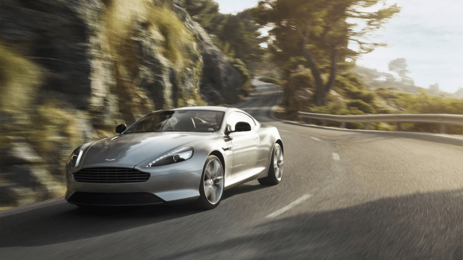
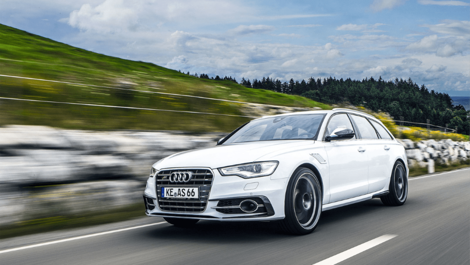
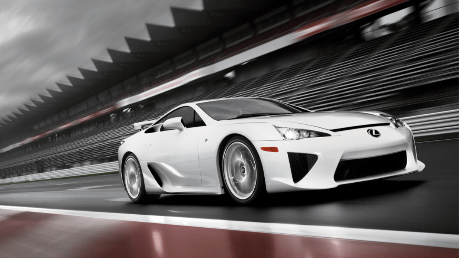
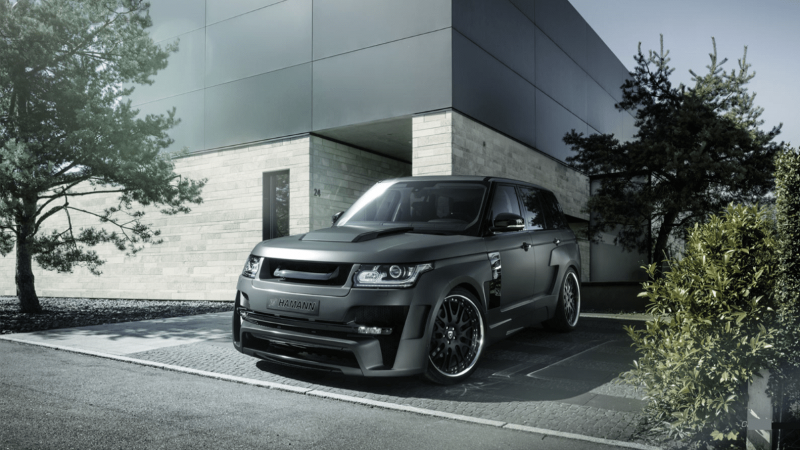
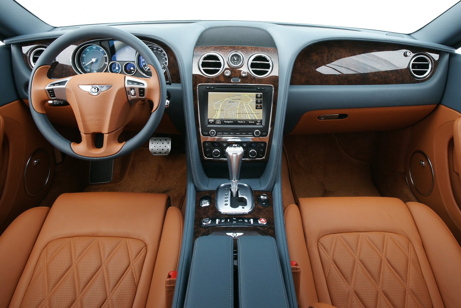
We stock a wide variety of inventory at our dealership, from used cars, used trucks, used vans, used SUVs, and used Powersports. Each vehicle in our inventory goes through a rigorous inspection process to make sure that your vehicle is in the best condition.

Customer satisfaction is what we do best. All of our sales associates are not on commission at our dealership, to ensure that you have an honest sales experience with us. Come in today and see for yourself why so many people choose us!
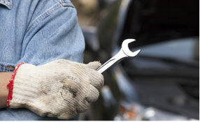
We have a full service and repair facility onsite, and we can help you with any service related automotive needs that you may have. Let our professional service team members help you today. Call and make an appointment.
Responsive web design (RWD) is an approach to web design which makes web pages render well on a variety of devices and window or screen sizes. Recent work also considers the viewer proximity as part of the viewing context as an extension for RWD. Content, design, and performance are necessary across all devices. A site designed with RWD adapts the layout to the viewing environment by using fluid, proportion-based grids, flexible images, and CSS3 media queries.
The fluid grid concept calls for page element sizing to be in relative units like percentages, rather than an absolute unit like pixels or points. Flexible images are also sized in relative units, so as to prevent them from displaying outside their containing element.